Now I have my logo I can now start the second half of my brief which is to design a poster and animated web banner for the client. Going with the idea of connectivity I have decided to start on the poster idea looking at creating a jigsaw puzzle with the boho face on it. This will be just a first idea before I put tag lines and other info on the design. I may also have pieces of the jigsaw puzzle missing, quite like the idea of have the a piece with the word zone on it missing so it would be like putting the zone in a zone if that makes any sense. Another idea I may look at is using instructions to put something together, the boho face again maybe? Anyway here is the first jigsaw puzzle idea I've come up with:
Sunday, 26 December 2010
Tuesday, 21 December 2010
Boho face developments
I really like the grey and lime green colour combination and so did my lecturer, however she was unsure on the lime green box around the Boho face and suggested I refined the logo slightly, she did however think the concept was great so that was a big confidence booster! Below I have experimented with different colours to see whether the logo design would look better in different swatches and still look effective in different formats. I have also refined the bottom of the "b" removing the sans serif and adjusted the top of the head curve so its more rounded, this I still feel, needs some more work but its getting there. Because my lecturer was unsure of the rectangle box around the logo I have decided to change the format to a square to see if this has any better aesthetic qualities and I also felt that having a rectangle was unnecessary because there was pointless spacing either side of the Boho face which didn't need to be there because it sits nicely in a square and still has negative spacing in two opposite corners. I don't yet know which one of the colour schemes and themes I'll proceed with but I'll as some opinions first before deciding, therefore any comments welcome!
Friday, 17 December 2010
Some fantastic 3D landscape pictures!
Make sure you check out http://miniaturestonelandscapes.weebly.com/ if your interested in looking at some great 3D pictures! John Illingworth basically extends the back of a photo frame and creates a mini drystone wall landscape infront of a photo.
Wednesday, 15 December 2010
Tuesday, 14 December 2010
Canon PIXMA Bring colour to life The making of video
This is a really interesting video, well worth a watch! For more info and some great stills check out http://www.designboom.com/weblog/cat/10/view/11774/dentsu-paint-sound-sculptures.html
Final logo design
Fingers crossed after getting some feedback this hopefully should be my final logo design. I decided that boho zone didn't need to be written below the "boho face" as you can see quite clearly what the word says without having it repeated underneath.
Saturday, 11 December 2010
ITV introduction to an England football match
I think the animation in this video is great, really good creativity with such a fresh approach.
Friday, 10 December 2010
The boho face
Talked to one of the tutors about my previous designs and they basically said using arrows to show the whole digital theme, was a too broad a representation to fit this particular client. Therefore, I have come up with the design below which is really simple but hopefully it looks slightly like a face. Joining up the b and h is supposed to show the connections between the buildings in the boho zone and how everybody is close and in a community almost.
Thursday, 9 December 2010
logo design simplified further
Had another play around on illustrator getting slightly frustrated at a lack of new ideas and decided to just simplify designs down further. The idea that the blue arrow is pointing to I believe is the best because of its simplicity which gives it a clean, bold look. Click on the image to make it bigger
Sorry the quality of the image isn't that good but these are my latest trial ideas for the Boho logo. The bottom design is my favourite and is the one I'm most likely going to develop further. Trying to go for a simple but clear design which can be played around in scale without effecting the overall impact drastically. I wanted to keep the arrow cursor theme going so that's in there representing a click on the 2nd "O"
Tuesday, 7 December 2010
Berlin
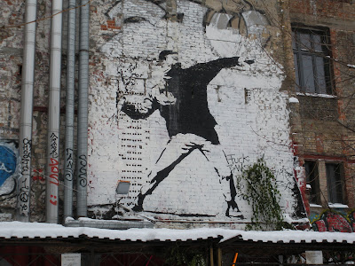
Last week I went to Berlin with the Uni which was a brilliant experience. Berlin is just full of graffiti, its everywhere! We saw an actual Banksy which was pretty ace and visited the studios of DGV (Gestalten) and Pentagram. We also checked out the Christmas markets and went ice skating whilst it was -16 degrees C, crazy!
Banksy
Banksy
Random graffiti everywhere!
The Christmas Markets had such an amazing atmosphere, got us in the Christmas mood all right!
Monday, 6 December 2010
A few design ideas for Boho Zone logo
My current project is to design a logo design for the Boho Zone in Middlesbrough. This is a building which houses varies digital designers and companies together under one roof. The building is displayed below:
As you can see the Boho Zone building includes three bridges in its design to connect its occupiers together so that they can efficiently help and work with each other if desired.
My logo ideas follow the whole connectivity and digital themes using arrows to represent the cursor of a computer mouse, I have then combined several arrows to form more interesting shapes/results. Below are just some of my ideas that follow the same theme:
Subscribe to:
Comments (Atom)


