Tuesday, 21 June 2011

Logo Design for David Spence Joinery

This is the logo work I did for my friends dad that is going self employed as a joiner.

This is my favourite development I did for the client because i think the "S" is a strong and eye catching symbol and is simple enough that it could be used on t-shirts, business cards, websites and other promotional material.


         The client wanted the logo to be more landscape and say a slightly different name underneath.
This is the logo the client chose after I changed the hammer head to a wood working hammer so it was more appropriate to his business.
Just a little experiment in a different colour.


Monday, 2 May 2011

D&AD AWARDS 2010 video made by the Light Surgeons


Amazing piece of creativity and experimental design by the Light Surgeons for the 2010 D&AD design awards 2010!

Wednesday, 13 April 2011

Fear video


The piece is based on fear and how the mind makes you scared of everyday objects when its dark because of the shadows they cast. This is for the motion piece that I'm doing for my latest project on Urban Slums.  

Wednesday, 6 April 2011

1st play around with stop motion

My Urban Casualties project is going in the direction of a stop motion piece so this video is just a really short play around piece just to get used to the technique and won't look anything like the final thing.


The concept is that a person is frightened and curls up in a ball.

Stop Motion

Here are some great stop motion pieces that I find really inspiring!


Wednesday, 30 March 2011

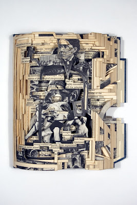
Brain Dettmer


I'm currently doing some research into different book arts and Brian Dettmer's work is brilliant: http://briandettmer.com/

Tuesday, 22 March 2011

Rememberable adverts


This is the new advert by Red Bull. I think its really effective because its rememberable because of its humour.

Type faces


As part of a little project i've set myself to do with faces I decided I wanted to create interesting and unique faces to show how all people are different. I thought it would be fun to create some face imagery using only type. As you can see above the results are quite silly but fun and certainly unique. My aim now is to create a short animation to practise with the Adobe after effects software and to create an even more interesting result.

Tuesday, 15 March 2011

A few more developments


The latter three images are based on the theme of being trapped, enclosed and confined. I've just played around with wire, took photos of them and changed the colours using photoshop.

Monday, 14 March 2011

More colour developments

Below are some more colour variations of some of the photos I took of the disfigured/melted carrier bags.


This is the only one that I've tried using multiple photographs over the top of each other in layers so far but I'm planning to try a few others.


Reminds me of a blood cell


Plastic bag experiments

In my latest experiments I decided to rip up carrier bags and melt them in the oven. I then photographed the deformed plastic and the image below is one of these photographs. 


Below is my favourite development where I've played around with the colours in the photograph.

Sunday, 13 March 2011

Urban Casualties

My latest project brief is where I had to add a second word to the theme "urban".  My second word is casualties which is based on the awful conditions that slummers that live in shanty towns have to put up with.


I watched the Comic Relief and Kevin McCloud programs on slums as a bit of research. Above are some screen shots from them. Below are some of my experiments so far:


I really like the last piece and want to take that further, I quite like the idea of creating something 3D like the pink abstract overview city. 

Thursday, 10 March 2011

MWM Graphics


I came across Matt W Moore after setting one of his images as the background on my google chrome browser. I've also seen his work in a magazine article and on his website, http://mwmgraphics.com/index.html His work combines different shapes and colours to form patterns which looks really good.

Monday, 28 February 2011

The Light Surgeons


Video made by The Light Surgeons. Its called "In Passing" and is about a woman in Manchester who is partially sited and she narrates her story and how she manages to get around the city. I think the group have approached the project in the best way using the actual woman's voice to get the message across in a really effective way. The digital/motion illustrations are a really nice touch and these are complemented by the text that reads out what she is saying. This I suppose makes the video subtable to the deaf also. Another quality that the video has is the lighting is really well used.

Theres also some other great graphic design by them on their website http://www.lightsurgeons.com/

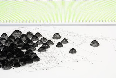
Anne Wilson


I've been trawling through a list of about 50 different artists, illustrators and designers to try and get inspiration for my latest project, urban. Anne Wilson's work has sent a chain of ideas flooding through my head about how I can create abstract busy images to represent the hustle and bussle of the city. Her website is http://www.annewilsonartist.com/

Geoff McFetridge

This is the work of Geoff McFetridge. It's similar to to the kind of work I want to achieve in one of my little projects I've set myself for the professional studies modules. The project is about faces, so I'm going to montage a load of drawn out faces together to create one big image.

Film Unit AV video


My latest project is on the theme Urban. I'm just starting by looking at artists and designers that do work on the same kind of material/topic to get inspiration. This video was shown on Channel 4's "One dot TV" in 1998. It features Film Unit AV and an urban based project which looks quite interesting an I could imagine some of the stills of the video would work quite nicely.

Wednesday, 23 February 2011

Jason Munn

Jason Munn produces great and witty poster designs usually incorporating more than one theme in one image. The following poster is a good example where he combined a paint brush, bucket and a guitar.


you can see more of his work @ ... http://www.thesmallstakes.com/index.php 

I think another interesting quality in his work is that he likes to use print making techniques. This comes from him having a degree in fine art rather than design.

Monday, 21 February 2011

Ken Reynolds

I came across this designer/illustrator simply by chance and I'm really glad I did. I've just checked out his website http://kenreynoldsdesign.co.uk/ and I got a really positive and creative vibe from it. His portfolio on there isn't huge but its all quality and he shows some really good ideas. I think more appropriately is that  the graphic design work he shows on there is the style I'd like to be producing myself when I get out there in industry.

 
This is one of the images he did for ipscreen and I think its really clear and has a good idea behind it. The other work he did for this company is really good to!

A SMILE IN THE MIND

I got this book for my Birthday last week and its brilliant! Full of witty ideas in design and includes a couple of example by Abram Games who I've covered in the past on this blog.


by Beryl McAlhone and David Stuart published by Phaidon

Final poster design


Pretty similar to the last development except I've set the tagline so that its level with the bottom of the "R" at the end of the "four" that comes down. This just makes the poster easier to read, follow and brings the eye down to the additional text below.

Although this advert was aired to viewers over two years ago I had to include it on the blog as I think its a really good comercial. It may seem like a crazy idea which would never exist but thats why its such a success because its different and catches the audiences attention. Barclays are a bank and by portraying their products as a fun way of life it works as a very good marketing tool. The advert has even inspired an app for the iphone/ipod touch which is based on the waterslide advert.


This is the latest advert by Virgin Atlantic. I think they've done it really well, portraying themselves as a sexy, stylish airline and a place to be.

Wednesday, 16 February 2011


This is the latest development to the road to nowhere poster. I've changed the logo to the rectangular film 4 logo as it fits better within my design and the tutor prefers this one for this brief. I've chosen to have the "four" vertical so it leads down to the text to the right. With this I've also added some hierarchy to the different sections of text with different shades of grey and point size.  

Friday, 11 February 2011

poster developments


I got rid of the movie board as it complicated the design giving two concepts almost. Therefore I decided to focus on the cross word and I decided to use a grey colour instead of a traditional crossword black to make it look more contemporary. However, in my tutorial the tutor said it needed more of an impact and that I should maybe take some of the contact details etc out of the crossword and use the traditional black. So its back to the drawing board and I'll try again.   


This is my latest design for the film genre event. The clues on the right hand side are not the ones I will use but this gives an idea of layout. As far as composition goes I believe this design is far better in terms of proportions and placement. The black is bold, eye catching and striking so will attract attention from further away better. My next step is to maybe make the crossword fit directly above the text and have the poster in a elongated format. 

Wednesday, 9 February 2011

Road to nowhere


This is a poster design brief I'm currently working on where I've got to come up with a design for the road movie film genre. The poster must promote a festival sponsored by filmfour which is based around that genre. The concept behind my design is fulfilment/destiny.

Sunday, 23 January 2011

miniature stone landscapes branding


I'm currently doing some branding work for miniature stone landscapes. You can check out his website @ miniaturestonelandscapes.weebly.com. At the moment I'm just concentrating on getting a logo sorted and above are some designs I've come up with. I quite like the first design on the second row but it's just early stages in development so I'm not sure what kind of a theme I'm going for yet. Can't get the images very big on the blog but if you click on the logos they will open much bigger.


Friday, 21 January 2011

Photoshop Handsome by Everything Everything

This was Fearne Cotton's record of the week on radio 1 a few weeks ago and she's played it quite a bit ever since. At first I wasn't bothered by the song but its grown on me. She talked about how the 2010 version of the video for the track was created by several different animators who were given only a few seconds each to create something. If you watch the video its really interesting how so much creativity can be combined in such a fresh and down to earth approach.

Whats also interesting is the difference between the 2009 and 2010 versions of the video, check them both out below:


                                                                2010 version:


2009 version:


Monday, 10 January 2011

Recent Developments-posters

This is the first poster design for boho I did, its based on the idea of connectivity in the boho zone.


After a few developments of the above design, I took the idea to my lecturer who approved of the overal theme and idea but suggested I try and involve and show the content of the boho zone i.e. the creativity and digital media better. Therefore I have produced the design below, the connectivity element is still represented with the jigsaw which also has circuit board type qualities to it but i have also added the firework explosion to show the creativity side of the boho zone by representing bright ideas, thinking and excitement. The logo needs to be altered in colour slightly because it doesn't look right on black in that certain shade of lime green but other than that I'm happy with the overall concept of the design.