Wednesday, 30 March 2011
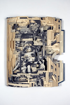
Brain Dettmer
I'm currently doing some research into different book arts and Brian Dettmer's work is brilliant: http://briandettmer.com/
Sunday, 27 March 2011
Really useful advice!!!
Tips on how to be a successful freelancer from Jessica Hische: http://jessicahische.com/spendstoomuchtimeinternetting/?p=791
Tuesday, 22 March 2011
Rememberable adverts
This is the new advert by Red Bull. I think its really effective because its rememberable because of its humour.
Type faces
Tuesday, 15 March 2011
A few more developments
The latter three images are based on the theme of being trapped, enclosed and confined. I've just played around with wire, took photos of them and changed the colours using photoshop.
Monday, 14 March 2011
More colour developments
Below are some more colour variations of some of the photos I took of the disfigured/melted carrier bags.
This is the only one that I've tried using multiple photographs over the top of each other in layers so far but I'm planning to try a few others.
Reminds me of a blood cell
Plastic bag experiments
In my latest experiments I decided to rip up carrier bags and melt them in the oven. I then photographed the deformed plastic and the image below is one of these photographs.
Below is my favourite development where I've played around with the colours in the photograph.
Sunday, 13 March 2011
Urban Casualties
My latest project brief is where I had to add a second word to the theme "urban". My second word is casualties which is based on the awful conditions that slummers that live in shanty towns have to put up with.
I watched the Comic Relief and Kevin McCloud programs on slums as a bit of research. Above are some screen shots from them. Below are some of my experiments so far:
I really like the last piece and want to take that further, I quite like the idea of creating something 3D like the pink abstract overview city.
Thursday, 10 March 2011
MWM Graphics
I came across Matt W Moore after setting one of his images as the background on my google chrome browser. I've also seen his work in a magazine article and on his website, http://mwmgraphics.com/index.html His work combines different shapes and colours to form patterns which looks really good.
Wednesday, 2 March 2011
Subscribe to:
Comments (Atom)


