Tuesday, 21 June 2011

Logo Design for David Spence Joinery

This is the logo work I did for my friends dad that is going self employed as a joiner.

This is my favourite development I did for the client because i think the "S" is a strong and eye catching symbol and is simple enough that it could be used on t-shirts, business cards, websites and other promotional material.


         The client wanted the logo to be more landscape and say a slightly different name underneath.
This is the logo the client chose after I changed the hammer head to a wood working hammer so it was more appropriate to his business.
Just a little experiment in a different colour.


Monday, 2 May 2011

D&AD AWARDS 2010 video made by the Light Surgeons


Amazing piece of creativity and experimental design by the Light Surgeons for the 2010 D&AD design awards 2010!

Wednesday, 13 April 2011

Fear video


The piece is based on fear and how the mind makes you scared of everyday objects when its dark because of the shadows they cast. This is for the motion piece that I'm doing for my latest project on Urban Slums.  

Wednesday, 6 April 2011

1st play around with stop motion

My Urban Casualties project is going in the direction of a stop motion piece so this video is just a really short play around piece just to get used to the technique and won't look anything like the final thing.


The concept is that a person is frightened and curls up in a ball.

Stop Motion

Here are some great stop motion pieces that I find really inspiring!


Wednesday, 30 March 2011

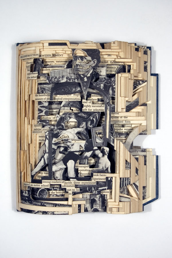
Brain Dettmer


I'm currently doing some research into different book arts and Brian Dettmer's work is brilliant: http://briandettmer.com/

Tuesday, 22 March 2011

Rememberable adverts


This is the new advert by Red Bull. I think its really effective because its rememberable because of its humour.

Type faces


As part of a little project i've set myself to do with faces I decided I wanted to create interesting and unique faces to show how all people are different. I thought it would be fun to create some face imagery using only type. As you can see above the results are quite silly but fun and certainly unique. My aim now is to create a short animation to practise with the Adobe after effects software and to create an even more interesting result.

Tuesday, 15 March 2011

A few more developments


The latter three images are based on the theme of being trapped, enclosed and confined. I've just played around with wire, took photos of them and changed the colours using photoshop.

Monday, 14 March 2011

More colour developments

Below are some more colour variations of some of the photos I took of the disfigured/melted carrier bags.


This is the only one that I've tried using multiple photographs over the top of each other in layers so far but I'm planning to try a few others.


Reminds me of a blood cell


Plastic bag experiments

In my latest experiments I decided to rip up carrier bags and melt them in the oven. I then photographed the deformed plastic and the image below is one of these photographs. 


Below is my favourite development where I've played around with the colours in the photograph.

Sunday, 13 March 2011

Urban Casualties

My latest project brief is where I had to add a second word to the theme "urban".  My second word is casualties which is based on the awful conditions that slummers that live in shanty towns have to put up with.


I watched the Comic Relief and Kevin McCloud programs on slums as a bit of research. Above are some screen shots from them. Below are some of my experiments so far:


I really like the last piece and want to take that further, I quite like the idea of creating something 3D like the pink abstract overview city. 

Thursday, 10 March 2011

MWM Graphics


I came across Matt W Moore after setting one of his images as the background on my google chrome browser. I've also seen his work in a magazine article and on his website, http://mwmgraphics.com/index.html His work combines different shapes and colours to form patterns which looks really good.

Monday, 28 February 2011

The Light Surgeons


Video made by The Light Surgeons. Its called "In Passing" and is about a woman in Manchester who is partially sited and she narrates her story and how she manages to get around the city. I think the group have approached the project in the best way using the actual woman's voice to get the message across in a really effective way. The digital/motion illustrations are a really nice touch and these are complemented by the text that reads out what she is saying. This I suppose makes the video subtable to the deaf also. Another quality that the video has is the lighting is really well used.

Theres also some other great graphic design by them on their website http://www.lightsurgeons.com/

Anne Wilson


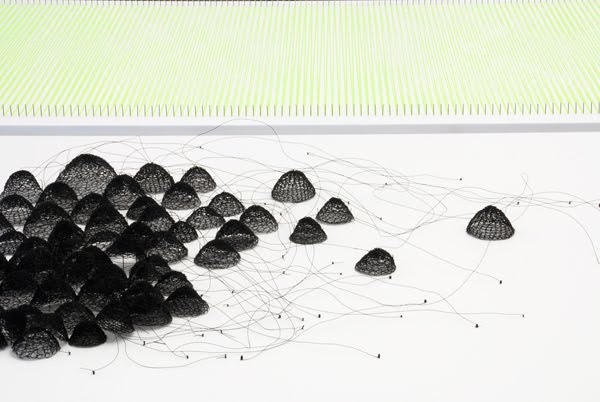
I've been trawling through a list of about 50 different artists, illustrators and designers to try and get inspiration for my latest project, urban. Anne Wilson's work has sent a chain of ideas flooding through my head about how I can create abstract busy images to represent the hustle and bussle of the city. Her website is http://www.annewilsonartist.com/