Monday, 28 February 2011
The Light Surgeons
Video made by The Light Surgeons. Its called "In Passing" and is about a woman in Manchester who is partially sited and she narrates her story and how she manages to get around the city. I think the group have approached the project in the best way using the actual woman's voice to get the message across in a really effective way. The digital/motion illustrations are a really nice touch and these are complemented by the text that reads out what she is saying. This I suppose makes the video subtable to the deaf also. Another quality that the video has is the lighting is really well used.
Theres also some other great graphic design by them on their website http://www.lightsurgeons.com/


Anne Wilson
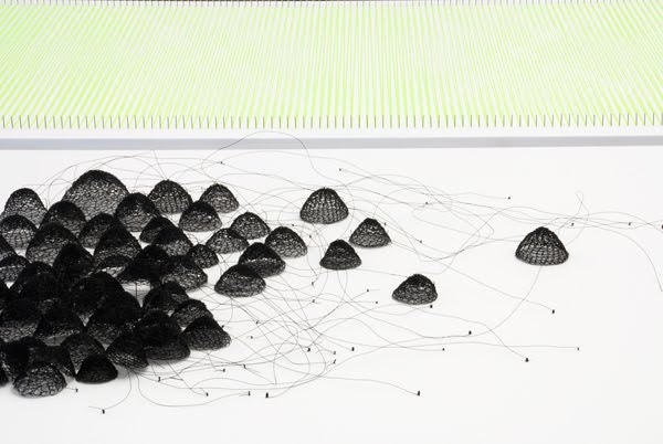
I've been trawling through a list of about 50 different artists, illustrators and designers to try and get inspiration for my latest project, urban. Anne Wilson's work has sent a chain of ideas flooding through my head about how I can create abstract busy images to represent the hustle and bussle of the city. Her website is http://www.annewilsonartist.com/
Geoff McFetridge
This is the work of Geoff McFetridge. It's similar to to the kind of work I want to achieve in one of my little projects I've set myself for the professional studies modules. The project is about faces, so I'm going to montage a load of drawn out faces together to create one big image.


Film Unit AV video
My latest project is on the theme Urban. I'm just starting by looking at artists and designers that do work on the same kind of material/topic to get inspiration. This video was shown on Channel 4's "One dot TV" in 1998. It features Film Unit AV and an urban based project which looks quite interesting an I could imagine some of the stills of the video would work quite nicely.
Wednesday, 23 February 2011
Jason Munn
Jason Munn produces great and witty poster designs usually incorporating more than one theme in one image. The following poster is a good example where he combined a paint brush, bucket and a guitar.


you can see more of his work @ ... http://www.thesmallstakes.com/index.php
I think another interesting quality in his work is that he likes to use print making techniques. This comes from him having a degree in fine art rather than design.
Monday, 21 February 2011
Ken Reynolds
I came across this designer/illustrator simply by chance and I'm really glad I did. I've just checked out his website http://kenreynoldsdesign.co.uk/ and I got a really positive and creative vibe from it. His portfolio on there isn't huge but its all quality and he shows some really good ideas. I think more appropriately is that the graphic design work he shows on there is the style I'd like to be producing myself when I get out there in industry.

This is one of the images he did for ipscreen and I think its really clear and has a good idea behind it. The other work he did for this company is really good to!

This is one of the images he did for ipscreen and I think its really clear and has a good idea behind it. The other work he did for this company is really good to!
A SMILE IN THE MIND
I got this book for my Birthday last week and its brilliant! Full of witty ideas in design and includes a couple of example by Abram Games who I've covered in the past on this blog.


by Beryl McAlhone and David Stuart published by Phaidon
Subscribe to:
Posts (Atom)